

Community Compass
Community Compass is an information database of local services and programs where users are also able to engage with the application as a contributor and provide services for their local community themselves.
Project Outline
Problem
A centralized platform for accessing accurate and timely information about programs and free services is currently missing
Goal
Design an accessible and centralized tool that ensures users have the most current and relevant details about programs and free services
Deliverables
User research
Low fidelity prototype
Team Members
Lauren Dunn
Tabitha Miller
Vaishu Vadlamani
Adam Leon
Daniel Huerta
Gingi McGuire
Method
Time
UX/UI Design Thinking
4 weeks
Connecting Community
“Design is not just what it looks like and feels like. Design is how it works. “ - Steve Jobs
Our group was given this project to work on over the course of 4 weeks with the final deliverables expected to be a low fidelity mobile prototype and a presentation of the design process that we executed to complete our project. The primary goal of this project was to provide each of us with hands-on experience in the research phase of the design process, especially in a team setting. Through research, we developed empathy for our target user base, which shaped our decisions on prioritizing information and functionalities during brainstorming and design. Collaborating as a team also taught us to handle respectful disagreements, communicate effectively, and work together to find solutions.
Envisioned as a mobile app and website, Community Compass blends features from Google, Yelp, and Instagram to bridge the gap between those seeking and offering aid within their community. Our mission is to create a centralized hub for accessing local support and services. Countless organizations and government initiatives remain underutilized due to limited public awareness. By developing a national database of humanitarian resources and empowering others to create and promote community programs, we strive to make aid more accessible and help people progress in life.
“An estimated 49 million people, or 1 in 6 people in the U.S., received help from the charitable food sector”
— Feeding America
“A 2017 study at the University of Florida found that just 38% of food insecure students reported using the campus food pantry.”
— Josh Salsbury, Western Oregon University

Design Thinking
Phase 1: Empathize
Kickstarting the Project: Proto Personas and Initial Insights
Our project began with a jam session in Figma to brainstorm traits and behaviors that we believe our users would have for our app. Initially, Community Compass was focused on being a resource for the unhoused or for those of very low socioeconomic status and our Proto Persona reflected that perception.

Asking the Right Questions: Exploring Community Needs
However, as we discussed our plans for public interviews we recognized that our app would be useful for people at any level of society. We then altered our original list of questions to be voiced for a broader range of people. We did not want our questions to carry the assumption that those we are interviewing are living under the poverty line.
Community, Resources, and Access were determined to be the 3 key themes that we wanted our interview questions to gather data on. Collecting this information helped us efficiently capture the common desires and needs of people within selected demographics.

20-Minute Conversations: Understanding Our Target Groups
We each interviewed a person for 20 minutes from one of the following groups: unhoused individuals, students, post grads, and senior citizens. These interviews were held either in person or through a video call. An interview guide was made to keep on hand so that we were reminded to be respectful of the other person’s time and remain on topic.

Design Thinking
Phase 2: Define
Synthesizing Insights: Creating an Affinity Diagram
Following the conclusion of our interviews, we synthesized the data that we had collected by creating an Affinity Diagram. This diagram was created by writing down key points from our interview answers on sticky notes and organizing them on a shared board based on various criteria. Structuring our data like this allowed us to easily visualize the thoughts of our target demographic and quickly pick out key points. Data itself is great to have but it is not actionable so we must analyze it and together determine the best interpretation.

Meet Ivan Smith: Crafting a User Persona
With the new data collected we created our User Persona, Ivan Smith. Money has been extremely tight in Ivan's life since being laid off a year ago and he often has to visit food pantries to eat. Ivan has a job interview lined up but unfortunately he doesn't have any clean clothes and needs a haircut. Usually, Ivan has people in town that can help him out but they all moved away months ago.

Empathy Mapping: Stepping Into Ivan Smith's Shoes
We then compiled our data to create an Empathy Map of Ivan Smith. This was done by further condensing the information that we organized in our Affinity Diagram into 4 aspects that make up who Ivan is. This new diagram helps us take a quick glance and step into the target user’s shoes to have a better understanding of their thoughts, feelings, and actions. Our chances for a high user retention rate is increased when we know how our users think and what would catch their attention.

Design Thinking
Phase 3: Ideate
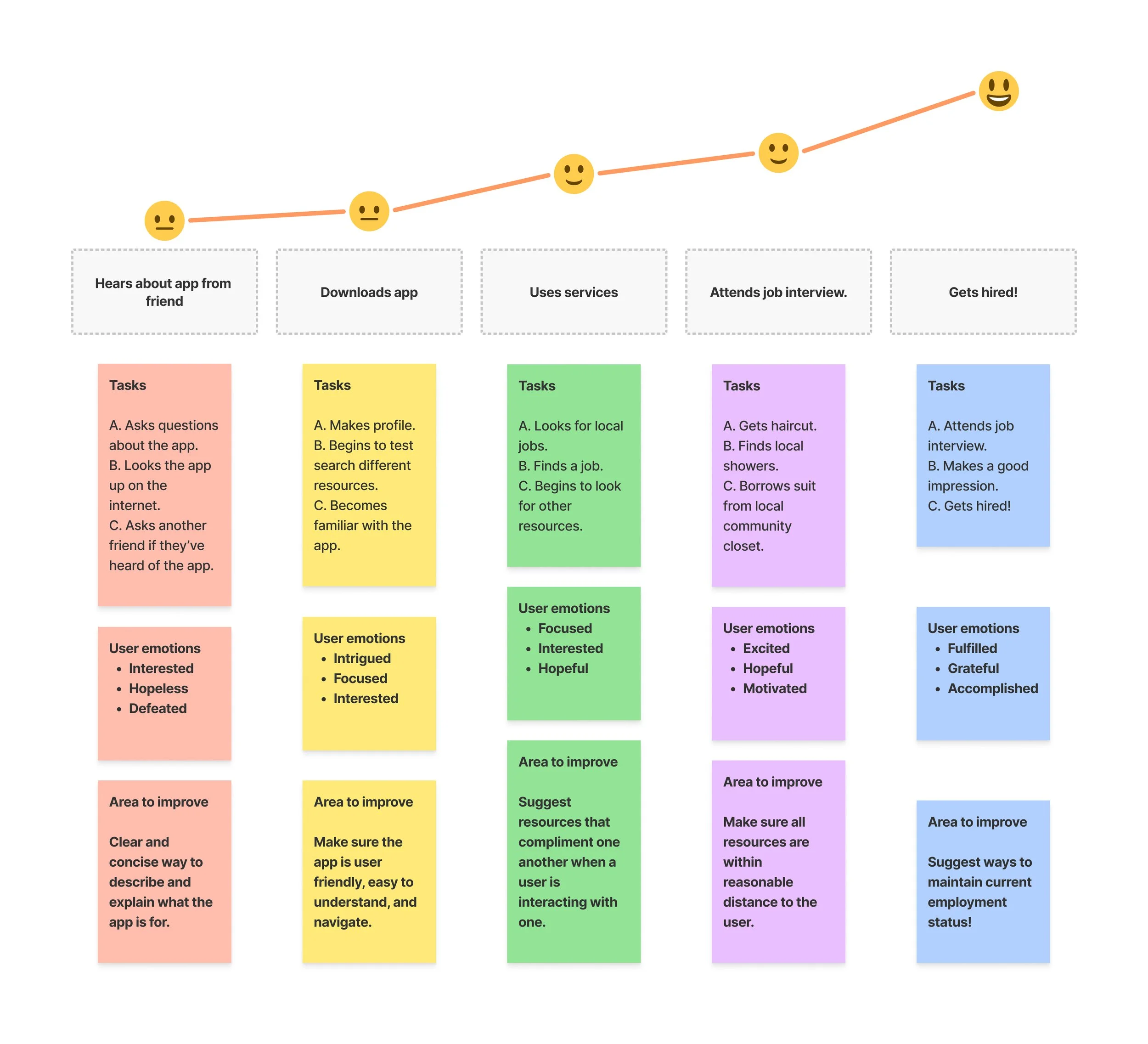
Mapping Success: Ivan’s User Journey
A User Journey Map was created to visualize the emotional and physical process of Ivan Smith downloading our app and dramatically improving his life because of it. This map also provides an opportunity to think about areas that could receive some improvement. At the final stage of the journey we celebrate the triumph of our users getting a job but then recognized that we should implement something that helps users maintain their employment status.
Storyboarding Ivan’s Journey: A Visual Narrative
Furthermore, we illustrated Ivan’s journey by creating a user scenario expressed in comic panel format and Gingi McGuire was so kind as to provide us with the following illustrations. These short storyboards are great for quickly articulating what our product is and how it impacts users.

Brainstorming Essentials: The Feature Prioritization Process
Armed with a deeper understanding of our user, we brainstormed what functions we think the application should have and identify our top priorities. We did this by creating a Feature Prioritization Matrix. This was done by putting ourselves in the shoes of our user and thinking about what they might like about the app, what they wish there was, and what kind of things they want the app to do.
We then individually left our notes where we felt that they fit best. After everyone had placed their notes we held a discussion and voted for each individual note’s placement. Some ideas were great, others were good but just not plausible, and some were just functions that we decided were not necessary to add to our application.

Value Prioritization: Aligning User Needs and Product Goals
A Value Prioritization Matrix was created to visualize the value that our product provides to consumers for future stakeholders. This graphic presents the consumer base on the right and our product on the left. The consumer profile has a pain that is relieved by engaging with our product. These consumers will continue to use our product because they positively gain from it thus proving that there is a continuous need that our product can fulfill.

Design Thinking
Phase 4: Prototype
User Flow to Prototype: Mapping the Experience
After wrapping up the research portion of our project we each individually created our own low fidelity prototype using Figma. The process began by coming up with a User Flow chart to confirm the path that we would all be following as we design. The prototypes that we created followed the path of opening the app, logging in, landing on the home page, entering profile settings and updating the user’s current zip code.


Design Thinking
Phase 5: Test
Testing Usability: Collecting User Feedback Data
A Usability Testing plan was put together for volunteers to test our prototypes. We had two goals we wanted to have completed when presenting the prototype blind to a volunteer. The first goal was to simply input login information and the second goal was to access the profile settings and update the zip code currently on file. We individually recorded our tests and made notes on our findings.
During our evaluations, the primary positive feedback that we received was that our testers found the process of logging into the app to be intuitive. However, there were two primary points of criticism that we came across:
First: Most testers assumed that “settings” would be found under the 3 bar icon instead of the user profile icon.
Second: It makes more sense to directly input the new zip code first and then click “update zip” rather than to click update zip, enter the new zip, and then click save.
We made notes of these points to update our prototypes in our next iteration cycle.

Final Thoughts

Learning from User Feedback: Insights & Refinements
Following the completion of our project, we joined together to discuss the feedback that we received from our usability testing. The first point of discussion was about how important it is to understand what users instinctually assume from a UI. Creating an experience that frustrates the user and places things where they wouldn’t know to look will greatly increase the probability of failure. The second point was how important it is to do testing and have fresh eyes look over your design. It did not occur to me that the zip code update process was inefficient like that until the feedback was received. I really appreciated them making that point because I know a small inefficiency like that would drive me insane in real life.
Designing Together: Lessons in Scope & User Focus
Our team thoroughly enjoyed working together because we did not have to deal with any personality clashes or disrespect. We recognized that this experience is not always the norm and that in the future we will have to be prepared to work with people we don’t connect with as easily. We also made a couple of common design team mistakes together such as losing the concept of the persona and scope creep. Initially, the primary users we had in mind for our app were people living below the poverty line but as we talked together we realized that this application could benefit all people regardless of their level of income. This created a marketing issue and confused the amount of content that the app will contain among many other things. It is better to start with our ideas fully fleshed out than to think as we go because then it will just be added to infinitely and then we don’t even know what the app is anymore.
User Research in Action: Conversations With People
Lastly, I really enjoyed the research portion of this project the most. I went downtown to the Broadway Baptist Church in Fort Worth with 20 tacos in hand to share with people there and hopefully get to interview one of them. Eventually, I met Matt in front of the church and after about 30 minutes of general conversation he agreed to let me record his responses on my phone. He told me about his experiences on the street over the last 2 years and how he accesses aid in the community. Matt mentioned something that really stuck with me. He said that people on the street often wear clothes for a week and then throw it away because getting new clothing is rather easy and washing can be expensive. There is so much waste in our society but we seldom create solutions to these problems. Speaking with Matt confirmed for me that something like Community Compass needs to exist to help propel people into better futures by either partaking in the services or deciding to provide a service of their own. If we can just organize ourselves efficiently, our world can improve exponentially.